HTML Forms
The HTML <form> element creates a form for user input and acts as a container for input elements like text fields, checkboxes, radio buttons, and submit buttons. The <input> element is the most common form element.
HTML Input Types
The <input> element allows users to enter data.
Its appearance and behavior depend on the type attribute.
Input Type: text
Used for short, single-line text input (like names or usernames).
<label for="username">Username:</label>
<input type="text" id="username" name="username" />
Input Type: radio
Lets users choose one option from a group.
Multiple radio inputs share the same name value.
<form>
  <label><input type="radio" name="gender" value="male" /> Male</label>
  <label><input type="radio" name="gender" value="female" /> Female</label>
</form>
Input Type: checkbox
Allows users to select multiple options independently.
<form>
  <label><input type="checkbox" name="interest" value="coding" /> Coding</label>
  <label><input type="checkbox" name="interest" value="music" /> Music</label>
  <label><input type="checkbox" name="interest" value="sports" /> Sports</label>
</form>
Input Type: checked
The checked attribute sets the default selected state forradio or checkbox inputs.
<input type="radio" name="color" value="blue" checked /> Blue
<input type="radio" name="color" value="red" /> Red
Input Type: submit
Creates a button that sends the form data to the server.
<form action="/submit" method="post">
  <input type="text" name="username" placeholder="Enter username" />
  <input type="submit" value="Submit" />
</form>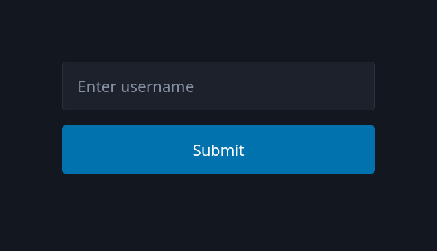
Input Type: button
Defines a generic button that performs no default action
unless controlled by JavaScript.
<input type="button" onclick="alert('Button clicked!')" value="Click Me!" />
Combining Multiple Inputs
Forms often use different input types together for richer interactivity.
<form>
  <label>Name: <input type="text" /></label><br />
  <label><input type="radio" name="plan" /> Free Plan</label>
  <label><input type="radio" name="plan" /> Premium Plan</label><br />
  <label><input type="checkbox" /> Subscribe to newsletter</label><br />
  <input type="submit" value="Sign Up" />
</form>
Common Input Attributes
Input attributes define how an input behaves, its default value,
and how it interacts with forms and users.
The value Attribute
Specifies the default text or value pre-filled in an input.
<input type="text" value="John Doe" />- This text appears when the page loads.
- The value is sent when the form is submitted.

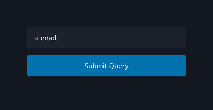
The name Attribute
Defines a key under which the input's value is sent in a form submission.
<form>
  <input type="text" name="username" value="ahmad" />
  <input type="submit" />
</form>- Essential for server-side processing.
- Without
name, the input data won't be included in the request.
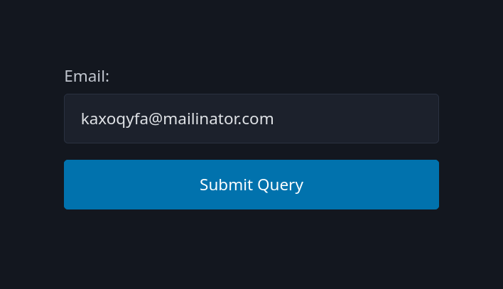
The required Attribute
Makes an input field mandatory before submission.
<form>
  <label>Email:</label>
  <input type="email" required />
  <input type="submit" />
</form>- The browser prevents form submission if the field is empty.
- Provides basic form validation without JavaScript.
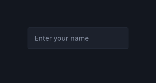
The placeholder Attribute
Displays hint text inside the input field until the user types something.
<input type="text" placeholder="Enter your name" />- Placeholder text disappears once the user starts typing.
- It should not replace the label for accessibility reasons.
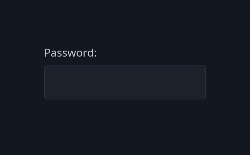
Input Type: password
Used to enter hidden or sensitive data like passwords.
<form>
  <label>Password:</label>
  <input type="password" name="password" required />
</form>- Characters are visually masked for privacy.
- The value is still accessible to the browser and submitted normally.
Combining Attributes
Most attributes can be combined to enhance usability.
<input
  type="password"
  name="pass"
  placeholder="Enter your password"
  required
  value=""
/>- Always use attributes intentionally to improve UX and validation.
- Avoid unnecessary defaults or hidden states.
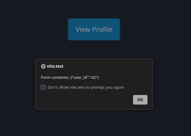
Input Type: hidden
Used to store data that users don't see or edit.
Commonly used for IDs, tokens, or metadata in forms.
<form action="/profile">
  <input type="hidden" name="user_id" value="42" />
  <input type="submit" value="View Profile" />
</form>- Hidden inputs are not visible but included in the form submission.
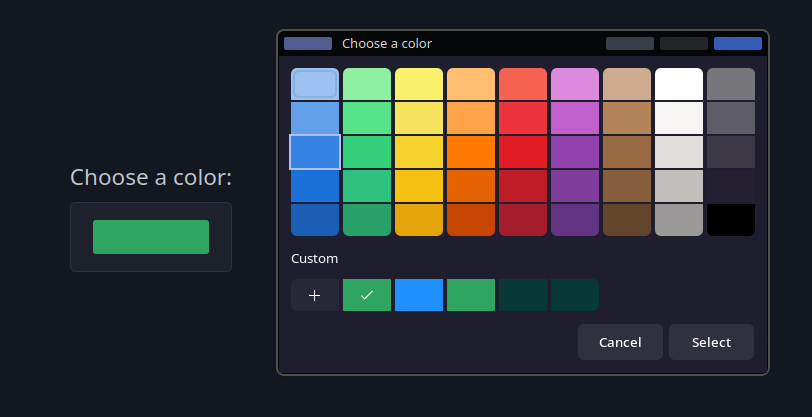
Input Type: color
Provides a color picker for selecting colors.
<label>Choose a color:</label>
<input type="color" name="themeColor" value="#1e90ff" />- Returns a hex color code like
#1e90ff. - Supported by most modern browsers.
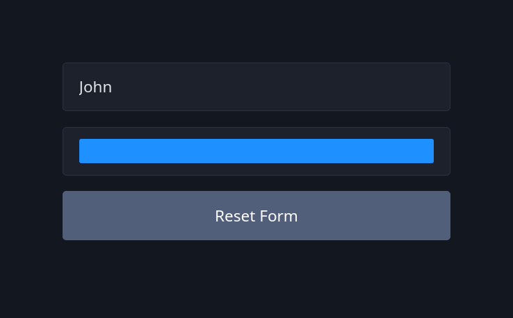
Input Type: reset
Resets all inputs in a form to their initial values.
<form>
  <input type="text" name="username" value="John" />
  <input type="color" value="#ff0000" />
  <input type="reset" value="Reset Form" />
</form>- It doesn't clear the form completely; it restores defaults.
- Often used alongside a submit button.
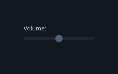
Input Type: range
Creates a slider control for numeric values within a defined range.
<label>Volume:</label> <input type="range" min="0" max="100" value="50" /> - Uses
min,max, andvalueattributes. - Can be styled for better UX.
- Ideal for settings like brightness or volume.
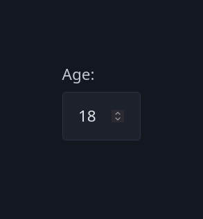
The min and max Attributes
Define numeric or date limits for applicable input types.
<label>Age:</label> <input type="number" name="age" min="18" max="60" />- Prevents invalid values outside the range.
- Works with
number,range,date, and similar types.
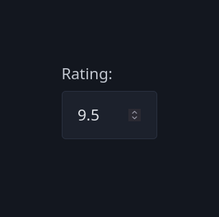
The step Attribute
Specifies the increment between allowed values.
<label>Rating:</label>
<input type="number" name="rating" min="0" max="10" step="0.5" />- Determines how much the value increases or decreases with each step.
- Works well for sliders and numeric fields.
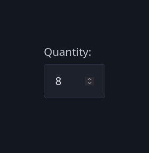
Input Type: number
Used for numeric input.
Includes built-in validation and increment controls.
<label>Quantity:</label>
<input type="number" name="qty" min="1" max="100" value="10" />- Prevents non-numeric input.
- Can use
min,max, andstepfor fine control.
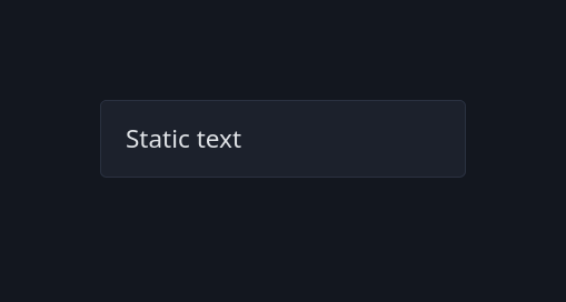
The readonly Attribute
Makes an input uneditable but still selectable and submittable.
<input type="text" value="Static text" readonly />- The value can't be changed by the user.
- Still included in form submission data.
The disabled Attribute
Disables an input completely — it's not editable, focusable, or submitted.
<input type="text" value="Disabled field" disabled />- Typically used for unavailable or system-managed fields.
- Visually appears grayed out.

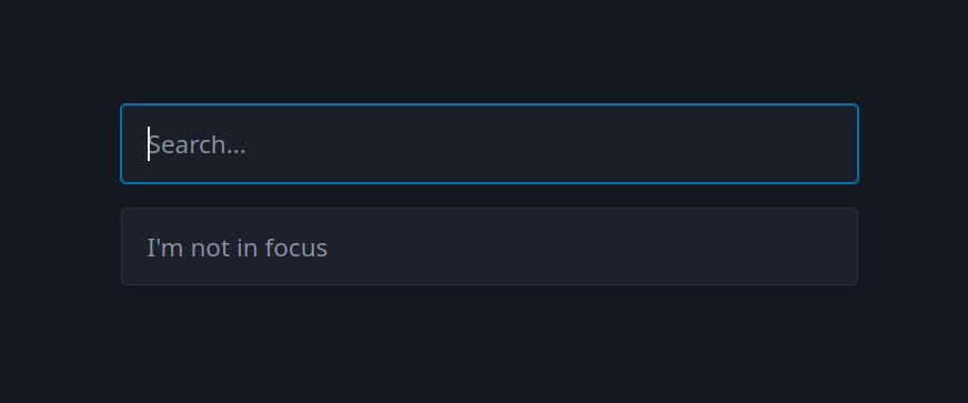
The autofocus Attribute
Automatically focuses an input when the page loads.
<input type="text" name="search" placeholder="Search..." autofocus />
<input type="text" name="something" placeholder="I'm not in focus" />- Improves usability in forms with a primary field.
- Only one element per page should have it.
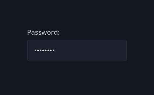
The minlength and maxlength Attributes
Control the minimum and maximum number of characters for text inputs.
<label>Password:</label>
<input type="password" name="password" minlength="4" maxlength="12" required />- Helps enforce consistent input length.
- Works with
text,password,email, and similar types.
Input Type: file
Allows users to upload files from their device.
<label>Upload profile picture:</label> <input type="file" name="avatar" />- Can use the
acceptattribute to limit file types. - Multiple file uploads are possible using
multiple.
<input type="file" name="photos" accept="image/*" multiple />
Input Type: search
Optimized for entering search queries.
<input type="search" name="query" placeholder="Search..." />- Behaves like a text input but may include a clear button.
- Semantically indicates a search field to browsers and screen readers.

Input Type: url
Used for entering web addresses.
<label>Website:</label>
<input type="url" name="homepage" placeholder="https://example.com" required />- Provides built-in validation for valid URL patterns.
- Often used in contact or profile forms.

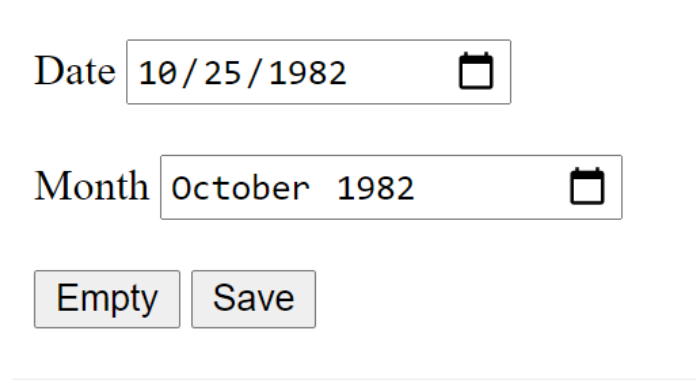
Input Type: date
Lets users pick a date from a calendar widget.
<label>Choose a date:</label>
<input type="date" name="appointment" min="2025-01-01" max="2025-12-31" />- Returns value in the format
YYYY-DD-MM(Based on user locale). - Browser-native UI ensures consistency and accessibility.

Input Type: month
Allows selection of a specific month and year.
<label>Billing month:</label>
<input type="month" name="billing" value="2025-11" />- Returns values like
2025-11. - Useful for billing cycles, reports, and schedules.

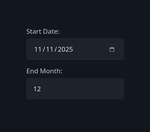
Combining Date and Month Inputs
They can work together for more precise data entry.
<form>
  <label>Start Date:</label>
  <input type="date" name="start" />
  <label>End Month:</label>
  <input type="month" name="end" />
</form>dateis more general;monthis suitable for period selection.
Input Type: time
Used for selecting a time of day (hours and minutes).
<label>Meeting time:</label> <input type="time" name="meeting" value="09:30" />- Returns value in
HH:MMformat. - Can use
min,max, andstepto control valid times.

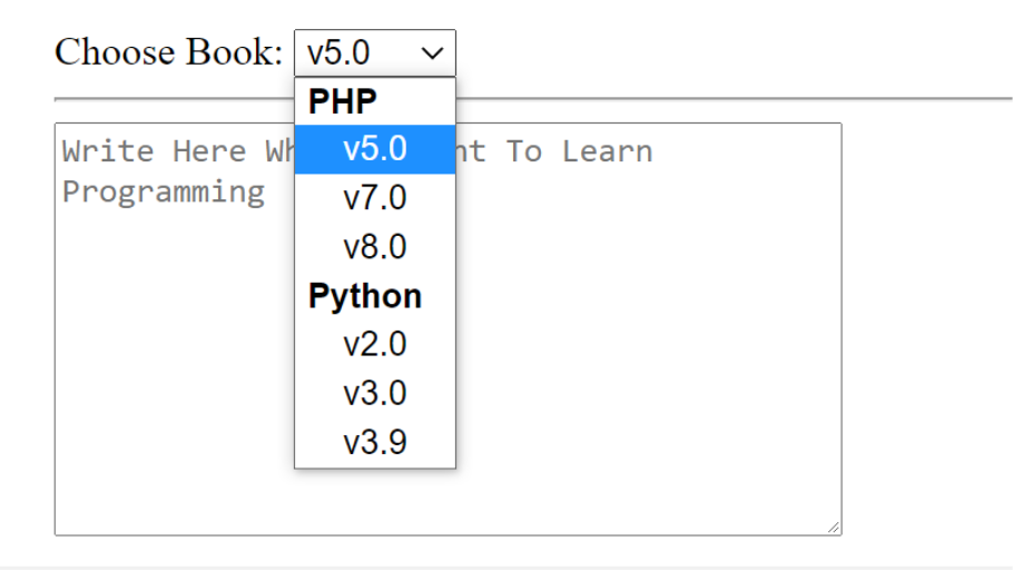
The <select> Element
Creates a dropdown menu for selecting one or more options.
<select id="city" name="city">
  <option value="cairo">Cairo</option>
  <option value="giza">Giza</option>
  <option value="alexandria">Alexandria</option>
</select>- Displays only one value but offers multiple choices.
- Works best for predefined, limited sets of options.

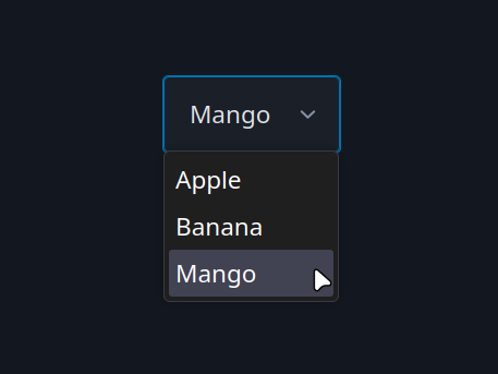
The <option> Element
Defines the available choices inside a <select> element.
<select name="fruit">
  <option value="apple">Apple</option>
  <option value="banana">Banana</option>
  <option value="mango">Mango</option>
</select>- The
valueattribute is sent when the form is submitted. - The text between
<option>tags is what users see.
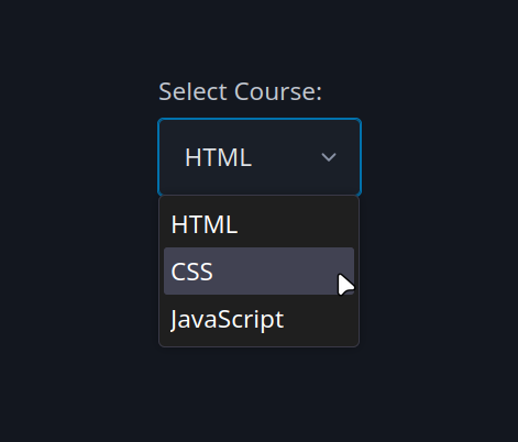
The label for <select>
Associates a label with a dropdown menu for better accessibility.
<label for="course">Select Course:</label>
<select id="course" name="course">
  <option value="html">HTML</option>
  <option value="css">CSS</option>
  <option value="js">JavaScript</option>
</select>- The
forattribute links the label to theselectelement by ID. - Clicking the label focuses the dropdown.
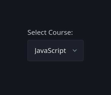
The selected Attribute
Specifies which <option> is pre-selected by default.
<select name="language">
  <option value="html">HTML</option>
  <option value="css">CSS</option>
  <option value="js" selected>JavaScript</option>
</select>- Only one option can be selected unless
multipleis used. - Improves user experience by setting a default choice.
The <textarea> Element
Allows multi-line text input for messages, comments, or descriptions.
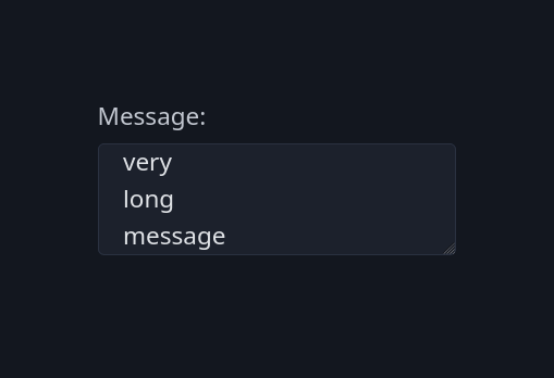
<label for="message">Message:</label>
<textarea id="message" name="message"></textarea>- Unlike
<input>, it doesn't use atypeattribute. - Text entered appears as plain text between the tags.
cols and rows Attributes
Define the visible width and height of a <textarea>.
<textarea
  name="feedback"
  rows="4"
  cols="40"
  placeholder="Enter feedback..."
></textarea>rows= number of visible text lines.cols= width in character units (approximate).- The size can also be styled with CSS.

Tasks
Let's apply what we have learned.
Task 1:
Task 3:
Task 2: